Archive

Posts Tagged ‘Review’

IPad 2 First Thoughts

March 12th, 2011 Comments off

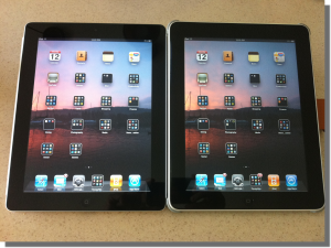
Spot the difference

What is it that drives someone to stand in line for three hours just for the privilege of spending $800 on something they don’t even need? Consumer society, anyone?

Anyhooo… After parting with said $800 I got my hands on a shiny new 64GB black iPad2 with an orange Apple Smart Cover.   After a brief detour for dinner on the way home I spent the remainder of the evening backing up iPad1 and restoring its contents to iPad2. After a very brief play with it last night, this morning I’ve started to dig around and see whether it really is any different.

Upgrading via iTunes: the process was relatively painless – backed up my iPad, plugged in and registered the iPad2, restored everything (slowwwww) and off we go. A few niggles – I had to re-enter all my email passwords (I have seven email accounts), and verify my credit card details for the Apple Store, AND re-enter all my account info for the various Twitter, Facebook etc apps. But overall was an easy process and everything went smoothly.

And 64GB is a lot more space than 16GB (yes, I know, 48GB) so I can finally have iTunes sync all the video podcasts and pictures that I want.

Camera: to quote Sebastian Page “Wow. The cameras on the iPad2 are really shit.” Yup. Really. The front camera has truly awful low light performance – trying to use it for FaceTime was not a good experience. The other tidbit is that the rear camera saves stills with less than 1 megapixel resolution. Welcome to 1996.

Weight: A year ago I wrote that iPad1 felt heavier than expected. iPad2 is 0.2lb lighter than iPad. It feels considerably lighter, but I think that my brain is being tricked by it being thinner and hence expecting it to be lighter. And it really is very noticeably thinner. The iFixit teardown says that this has been partly accomplished by reducing the thickness of the glass itself – only time will tell if this makes the iPad2 more susceptible to damage.

Screen: the screen looks very similar to iPad1. It should – it has the same resolution. Engadget has reported light bleeding from the side of the screen, and the poll on the site shows and many as 20% of other people have too! This is BAD. So far I haven’t noticed any problem with mine.

Performance: the iPad2 is noticeably faster, in some cases dramatically so.  Infinity Blade is still one of my favourite games. It loads A LOT faster, and responds much faster. I lost many matches on iPad because the touch interface wouldn’t respond fast enough. Not so on iPad2. It kept up easily. Bring on the monsters!
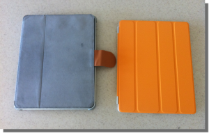
Smart Cover: Again to quote Sebastian Page “the smart cover is smart enough to protect the back, but not the front; I’m returning it tomorrow”. The cover is OK, and the magnetic attachment is really clever, but I think I’m going to switch to the MacAlly Bookstand 2BL cover when it comes out at the end of April. The MacAlly cover for my iPad1 has been great, and with the new one costing $29 (versus Apple’s $39/$59) it is a bargain.

Update:

FaceTime: just tried FaceTime for the first time with my cousin Jim and it works great.  The larger screen size really helps compared to the iPhone 4.

Overall: initial reactions are good but not great. Definitely feels much lighter and thinner; definitely faster and more responsive. The cameras I can take or leave.   If I hadn’t upgraded from 16 to 64GB I don’t think it would have been worth the money, but as it is I’m very pleased to have the iPad2, and I think Linda is going to love the iPad1.


p.s. Apple sold 300,000 iPads on the launch day nearly a year ago.  Judging by the line at the Apple Store in Boca Raton yesterday, I’ve got to believe they’ve beaten that number hands down this time around.
Categories: Technology Tags: ,

TechHit SimplyFile: must-have add-in for Outlook

July 9th, 2010 2 comments

Like many business people I use Microsoft Outlook.  In fact I’ve been using Outlook for a very long time – since before Outlook was Outlook and it was just called Microsoft Mail.  I’m also a bit of a hoarder.  As a consequence, I now have well over 80,000 emails.  I know, sad isn’t it?

Because of the size limitations of the old ‘PST’ format under Office 2003, those emails are spread across 10 different PST files.  And to help me find those emails (otherwise why file them in the first place), I have a fairly complex set of folders and sub folders.  3,500 of them.

I therefore have all kinds of problems trying to find emails (but that is for another post).  With that many folders I have problems filing messages in the first place.

I’m not sure if you’ve used Outlook’s filing capabilities very much, but they leave a lot to be desired.  Basically you can move a message to a folder or copy it there.  In either case you need to manually navigate to the destination folder.  Even with Outlook 2010’s improvements the process is still very cumbersome.

That is where ‘SimplyFile‘ comes in.  There’s a little company called TechHit based out of San Francisco that I came across a couple of years ago that develops cool add-ins for Outlook.  My favourite is SimplyFile, but TwinBox (which routes your Twitter feed to one or more Outlook folders) is also great.

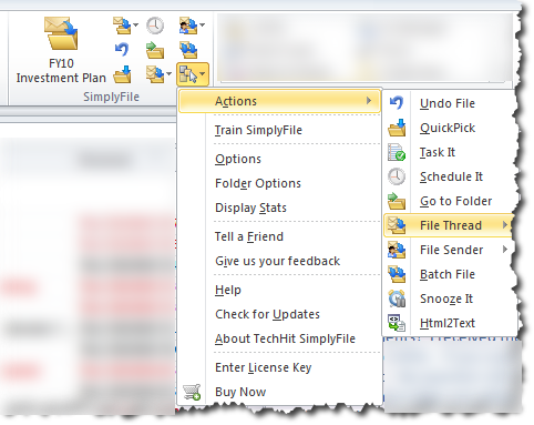
SimplyFile allows ‘one click’ (literally!) filing of email messages.  It either learns or you train it where you file messages.  As time goes on it gets smarter and smarter to the extent that (in my case) over 90% of the time it knows exactly which one of my 3,500 folders I want to file something in.  In the example to the right it is suggesting a folder called ‘FY10 Investment Plan.  I can accept the suggestion and just push the button, or I can choose from a list of five suggestions (which moves the probability to about 98%), or I can select any file using autosuggest as I type the folder name.

It will also let me file all the messages in the thread with a single click, or create an appointment from the message.  If I need to go to one of the 3,500 folders I can do that too: I start typing the name and it autosuggests the folder.

Version 3.0 has just been released and includes enhanced support for the Ribbon on Outlook 2010.

At $49.95 it isn’t cheap, but it is worth it.  You can download a free 30 day trial here and I’ll guarantee that once you’ve used it for a couple of weeks there’ll be no going back.

Categories: Technology Tags: ,

Why PopSci mag on the iPad sucks

April 8th, 2010 Comments off

Am I the only one who is profoundly dissatisfied with PopSci on the iPad? I ** love ** PopSci magazine and was so looking forward to the iPad version.

For me it utterly fails in UI design. It is totally unintuitive, has few visual cues and behaves inconsistently. Do I swipe up, down, left or right? Is the missing text below or to the right of what I’m reading? Where did the two finger drag come from?

USA Today and Marvel comics have shown what happens when great UI design is applied to a familiar subject. Why can’t I browse PopSci on iPad like I can with the magazine? Popups? Drill downs? Embedded videos? In app browsing?

Sorry PopSci. Don’t even get me started on the pricing, but without a back to basics rethink of the entire concept behind the iPad version I’ll be sticking with good old fashioned paper version.

Categories: Technology Tags: , ,

iPad – the first hour

April 3rd, 2010 Comments off

This is the first thing typed on the new iPad. I have to say that the onscreen keyboard is much easier to use than I thought it would be, and it is possible to type as quickly as with a normal keyboard almost immediately.

I’ve also downloaded Dragon Dictation, and if the first few attempts to use it on the iPhone are anything to go by it should make document creation on the iPad a doddle.

First impressions of the iPad generally?  Smaller than I expected, and much heavier. I knew it weighed 1.5 lbs before I picked it up, but the reality of it in your hands is deceiving.  It looks so delicate, but it seems to be built like a tank.

As an iPhone/iPod Touch user of two years, the user interface is utterly familiar and welcoming. Apple has done a great job of scaling the OS interface up to the new resolution, though why they chose the sparse icon layout is beyond me.

Haven’t had much chance to try many of the applications yet, but what I have tried works pretty well. The first minor disappointment is that I’ve yet to track down an iPad version of Facebook and the iPhone version looks lost in the middle of the screen. The ‘2x’ feature demo’d by Jobs at the launch is a stopgap at best, and makes iPhone apps look clunky.  The second is wiggy the WordPress app that I’m using to write this. Cutting and pasting doesn’t work, and there is no way to detach pictures that are added to a post.

Despite these teething troubles, overall the experience is better than expected – especially the typing.  The iPad definitely does not feel like a “big iPhone” and the experience is much more akin to a Mac with a different UI. I like it. A lot.

More news in a little while.

Categories: Technology Tags: , ,

Favourite iPhone App #12: TimeScroller

August 12th, 2009 Comments off

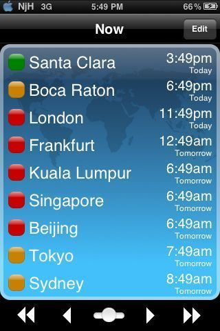
TimeScrolleris a niche app for those of us that attend conference calls across multiple timezones. It would also be useful if you need to call you granny in Australia or your friend in India and don’t want to wake them in the middle of the night.

Select as many cities as you wish and TimeScroller shows you whether it is a good time to call based on a red, yellow, green scale. You can select any local time and TimeScroller will show you the time in all the other locations.

Finally, TimeScroller can create an email with the times and locations listed. $1.99.

Categories: Technology Tags: , , ,