Archive

Author Archive

TechHit SimplyFile: must-have add-in for Outlook

July 9th, 2010 2 comments

Like many business people I use Microsoft Outlook.  In fact I’ve been using Outlook for a very long time – since before Outlook was Outlook and it was just called Microsoft Mail.  I’m also a bit of a hoarder.  As a consequence, I now have well over 80,000 emails.  I know, sad isn’t it?

Because of the size limitations of the old ‘PST’ format under Office 2003, those emails are spread across 10 different PST files.  And to help me find those emails (otherwise why file them in the first place), I have a fairly complex set of folders and sub folders.  3,500 of them.

I therefore have all kinds of problems trying to find emails (but that is for another post).  With that many folders I have problems filing messages in the first place.

I’m not sure if you’ve used Outlook’s filing capabilities very much, but they leave a lot to be desired.  Basically you can move a message to a folder or copy it there.  In either case you need to manually navigate to the destination folder.  Even with Outlook 2010’s improvements the process is still very cumbersome.

That is where ‘SimplyFile‘ comes in.  There’s a little company called TechHit based out of San Francisco that I came across a couple of years ago that develops cool add-ins for Outlook.  My favourite is SimplyFile, but TwinBox (which routes your Twitter feed to one or more Outlook folders) is also great.

SimplyFile allows ‘one click’ (literally!) filing of email messages.  It either learns or you train it where you file messages.  As time goes on it gets smarter and smarter to the extent that (in my case) over 90% of the time it knows exactly which one of my 3,500 folders I want to file something in.  In the example to the right it is suggesting a folder called ‘FY10 Investment Plan.  I can accept the suggestion and just push the button, or I can choose from a list of five suggestions (which moves the probability to about 98%), or I can select any file using autosuggest as I type the folder name.

It will also let me file all the messages in the thread with a single click, or create an appointment from the message.  If I need to go to one of the 3,500 folders I can do that too: I start typing the name and it autosuggests the folder.

Version 3.0 has just been released and includes enhanced support for the Ribbon on Outlook 2010.

At $49.95 it isn’t cheap, but it is worth it.  You can download a free 30 day trial here and I’ll guarantee that once you’ve used it for a couple of weeks there’ll be no going back.

Categories: Technology Tags: ,

Let’s kill a few learning holy cows – 70:20:10 is dead (or at least seriously ill)

May 9th, 2010 14 comments

Harold Jarche (@hjarche) recently wrote a blog post that contains a number of items I profoundly disagree with, so much so that it’s time for a new blog post from me.  I actually agree with many of his conclusions; unfortunately the road Harold takes to get there is filled with potholes.

Starting from the top, those potholes are:

  1. 80% of learning on the job is informal;
  2. individual learning in organizations is irrelevant;
  3. learner-centric learning objectives are not justifiable

I’ll take items two and three first, because the 80:20 ‘pothole’ is more of a bottomless pit and I’ll devote the bulk of this post to it.

Let’s start with: “individual learning in organizations is irrelevant”,  the argument being that work is done by teams and networks, therefore the individual is less/not important.  Whilst I absolutely support the implication in Harold’s post that context crucial and that none of us exist in a vacuum, I am reminded of one of my favourite quotes (if only I could remember who said it!) “Without people, companies are just depreciating assets”.  Organizations don’t learn (sorry Mr. Senge).  Teams don’t learn.  Networks don’t learn.  People learn.  People can learn to perform (better) in organizational, network or team contexts; they can even learn in teams, but organizations and teams don’t learn. (we could go off and discuss whether processes and/or culture count as organizational memory, but in both cases they are either created or instantiated by people.  Individual learning is it.  But context is crucial.

Next one: “learner-centric learning objectives are not justifiable”. Harold argues that learning objectives should be crafted as “the organization will be able to …”, not “the learner will be able to …”.  Again, organizations don’t do things. People do.  The role of the corporate learning organization is to develop human capability to execute business strategy.  A key skill of the members of the training team is therefore to work with business leaders to translate company goals and strategies into objectives that can be achieved via learning.  The goal of a learning program should be to “enable [employees/partners/customers…] to achieve [company objective].  Learning objectives should support the program goal.

Finally, let’s talk about the 80% thing (alternatively stated as the 70:20:10 rule – 70% of learning is informal/experiential, 20% comes from mentoring/feedback, and only 10% comes from formal learning).  The implication that often follows references to 70:20:10 is that we are wasting resources on formal training, and that social collaboration/informal learning is some sort of nirvana.

I really don’t want to target Harold for this one.  He’s simply repeating what many others have said before him.  The 70:20:10 mantra has reached almost hysterical levels in corporate learning circles.

But all is not what it seems.

I recently had the privilege to spend a few days at the Wharton Business School at the University of Pennsylvania with a number of academics and a hundred or so senior corporate learning folks like me.  We were attending the 2010 Global Leadership Congress organized by the Corporate University Exchange. (Great event, by the way.  Thanks Alan and team!)  Both prior to and during the event I spent time with Dr Doug Lynch. Doug opened my eyes about a few things, but most notably about 70:20:10.

Doug asked a couple of simple questions: (a) is 70:20:10 true, and (b) if so how do we know?  Everyone in the learning space seems to assume (a) is true, but we all get a bit vague about (b).  The answer to (b) is almost always “because I read it in ____ (insert your favourite training magazine title here)”.  Doug therefore set his post-grad students a simple challenge: find the source of the 70:20:10 concept.  The results are at best worrying and at worst frightening.  The following is taken from information presented by Doug at the event):

  • If you google “70:20:10” you get 2.25m hits.  That’s right, 2.25m.  Hits are split between the education model, and the business resource management model of the same name
  • “Informal learning” gets you 402,000 hits, as of the time of writing this post.
  • 70:20:10 was the subject of the 2009 ASTD study, “Tapping the Potential of Informal Learning” (exec summary PDF here)
  • There is even a Wikipedia article
  • Informal learning has been covered in just about every training publication and in the mainstream media, including the Harvard Business Review

The problem is that almost no-one, including the Wikipedia article and HRB cites the original research for 70:20:10 applied to education.

So what does the research have to say on 70:20:10?

  • If you step away from the mainstream, you get 46,800 hits with in Google Scholar
  • If you drill down to what might be called ‘authoritative sources’, things get a little narrower.  There are a grand total of 46 EBSCO (Peer reviewed) Articles
  • If you examine the peer reviewed articles, there is not one single empirical study that validates 70:20:10

That’s right.  Not one. (I hope someone out there can prove me – or rather Doug – wrong on this one)

70:20:10 was never researched; it was conceptualized by Tough in 1968 and put forward as a hypothesis.

Think about it.  All of that wild hysteria that has built up around social learning and collaboration?  All that time and dollars/pounds/euros you are spending on collaboration systems?  Built on a house of cards.  Er. Um.  Time for a headache pill.

Please don’t get me wrong.  I’m as big a supporter of collaborative and experiential learning and the use of social media and web 2.0 tools and techniques for learning as the next person, if not more so.

My engineering background would just like things to be on a bit firmer footing.  Any Academics out there up for a challenge?

Categories: Uncategorized Tags:

Why PopSci mag on the iPad sucks

April 8th, 2010 Comments off

Am I the only one who is profoundly dissatisfied with PopSci on the iPad? I ** love ** PopSci magazine and was so looking forward to the iPad version.

For me it utterly fails in UI design. It is totally unintuitive, has few visual cues and behaves inconsistently. Do I swipe up, down, left or right? Is the missing text below or to the right of what I’m reading? Where did the two finger drag come from?

USA Today and Marvel comics have shown what happens when great UI design is applied to a familiar subject. Why can’t I browse PopSci on iPad like I can with the magazine? Popups? Drill downs? Embedded videos? In app browsing?

Sorry PopSci. Don’t even get me started on the pricing, but without a back to basics rethink of the entire concept behind the iPad version I’ll be sticking with good old fashioned paper version.

Categories: Technology Tags: , ,

Is the iPad user agent string a problem?

April 7th, 2010 Comments off

I’ve run into my first real problem with the iPad (well, second if you count the the lack of Flash). The problem is a combination of poor web site design and something called the ‘user agent string’ that browsers send to websites.

When you use Safari on the iPad, it identifies itself to the web site using the following string:

Mozilla/5.0 (iPad; U; CPU OS 3_2 like Mac OS X; en-us) AppleWebKit/531.21.10 (KHTML, like Gecko) Version/4.0.4 Mobile/7B334b Safari/531.21.10

Some websites interpret this as a mobile browser and force you to a mobile (i.e., cut down often text-based) version of the site. This is frustrating, but is made unacceptable when sites don’t provide any mechanism to go to the full version of the site.

I haven’t done enough research to know whether this is an Apple problem (they should use a different browser string) or a web site one (they are interpreting the string incorrectly), or a combination of the two. Regardless, it is a pain!

Categories: Technology Tags: ,

Top ten iPad apps

April 4th, 2010 Comments off

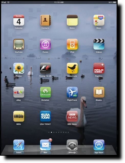
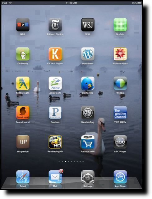
Here we go with a first pass at my top ten(ish) iPad apps, on the second morning with the iPad. I’ve excluded the built in apps from my list, but I’ll comment on a couple of them at the end. All apps listed are iPad versions unless otherwise stated.

1. USA today – this is exactly what an app on the iPad should be. It looks just like the paper version with all the familiarity that that brings, but fully exploits the iPad screen, UI and gestures. Excellent.

2. RealRacingHD – you are in a racing car. The iPad is your windscreen and your steering wheel. What more do you want? Good graphics and impressive performance make this a winner.

3. The Weather Channel (TWC MAX+) – the best weather app I’ve found so far.

4. FlightTrack Pro – builds on the iPhone version by adding flight tracks (with real time position info if the flight is in the air) overlaying a map.

5. F1 Timing 2010 – real time or recorded telemetry from official F1 timing-and-scoring. See the data the commentators use – in real time. Also includes real time track position on a 2D or 3D accurate representation of the track. See things unfold in real time, or watch practice, qualifying or the race as they happened.

6. Twittelator – current favorite Twitter app (thanks to @leolaporte for the recommendation). Previous to that it was Twitterific. Not impressed by the iPad version of Tweetdeck. Still like Reportage on the iPhone.

7. Dragon Dictation – absolutely impressed by the speech-to-text capabilities of this app. In some ways I wish that the iPad keyboard wasn’t quite so good. Although there is an iPad version, he minimalist interface doesn’t require the iPad, or benefit from it.

8. Photogene – great image editing app with a nice new interface for the iPad. Perfect for tidying up images for blog posts.

9. WebEx – haven’t had chance to try it in anger yet, but I loved WebEx on the iPhone and from the demo video included with the app, the iPad experience should be great.

10. See the images below for other honorable mentions – everything on the two screens are native iPad apps.

Categories: Technology Tags: ,