Archive

Archive for April, 2010

Why PopSci mag on the iPad sucks

April 8th, 2010 Comments off

Am I the only one who is profoundly dissatisfied with PopSci on the iPad? I ** love ** PopSci magazine and was so looking forward to the iPad version.

For me it utterly fails in UI design. It is totally unintuitive, has few visual cues and behaves inconsistently. Do I swipe up, down, left or right? Is the missing text below or to the right of what I’m reading? Where did the two finger drag come from?

USA Today and Marvel comics have shown what happens when great UI design is applied to a familiar subject. Why can’t I browse PopSci on iPad like I can with the magazine? Popups? Drill downs? Embedded videos? In app browsing?

Sorry PopSci. Don’t even get me started on the pricing, but without a back to basics rethink of the entire concept behind the iPad version I’ll be sticking with good old fashioned paper version.

Categories: Technology Tags: , ,

Is the iPad user agent string a problem?

April 7th, 2010 Comments off

I’ve run into my first real problem with the iPad (well, second if you count the the lack of Flash). The problem is a combination of poor web site design and something called the ‘user agent string’ that browsers send to websites.

When you use Safari on the iPad, it identifies itself to the web site using the following string:

Mozilla/5.0 (iPad; U; CPU OS 3_2 like Mac OS X; en-us) AppleWebKit/531.21.10 (KHTML, like Gecko) Version/4.0.4 Mobile/7B334b Safari/531.21.10

Some websites interpret this as a mobile browser and force you to a mobile (i.e., cut down often text-based) version of the site. This is frustrating, but is made unacceptable when sites don’t provide any mechanism to go to the full version of the site.

I haven’t done enough research to know whether this is an Apple problem (they should use a different browser string) or a web site one (they are interpreting the string incorrectly), or a combination of the two. Regardless, it is a pain!

Categories: Technology Tags: ,

Top ten iPad apps

April 4th, 2010 Comments off

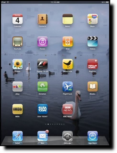
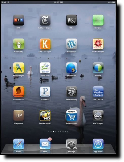
Here we go with a first pass at my top ten(ish) iPad apps, on the second morning with the iPad. I’ve excluded the built in apps from my list, but I’ll comment on a couple of them at the end. All apps listed are iPad versions unless otherwise stated.

1. USA today – this is exactly what an app on the iPad should be. It looks just like the paper version with all the familiarity that that brings, but fully exploits the iPad screen, UI and gestures. Excellent.

2. RealRacingHD – you are in a racing car. The iPad is your windscreen and your steering wheel. What more do you want? Good graphics and impressive performance make this a winner.

3. The Weather Channel (TWC MAX+) – the best weather app I’ve found so far.

4. FlightTrack Pro – builds on the iPhone version by adding flight tracks (with real time position info if the flight is in the air) overlaying a map.

5. F1 Timing 2010 – real time or recorded telemetry from official F1 timing-and-scoring. See the data the commentators use – in real time. Also includes real time track position on a 2D or 3D accurate representation of the track. See things unfold in real time, or watch practice, qualifying or the race as they happened.

6. Twittelator – current favorite Twitter app (thanks to @leolaporte for the recommendation). Previous to that it was Twitterific. Not impressed by the iPad version of Tweetdeck. Still like Reportage on the iPhone.

7. Dragon Dictation – absolutely impressed by the speech-to-text capabilities of this app. In some ways I wish that the iPad keyboard wasn’t quite so good. Although there is an iPad version, he minimalist interface doesn’t require the iPad, or benefit from it.

8. Photogene – great image editing app with a nice new interface for the iPad. Perfect for tidying up images for blog posts.

9. WebEx – haven’t had chance to try it in anger yet, but I loved WebEx on the iPhone and from the demo video included with the app, the iPad experience should be great.

10. See the images below for other honorable mentions – everything on the two screens are native iPad apps.
Categories: Technology Tags: ,

iPad – the first hour

April 3rd, 2010 Comments off

This is the first thing typed on the new iPad. I have to say that the onscreen keyboard is much easier to use than I thought it would be, and it is possible to type as quickly as with a normal keyboard almost immediately.

I’ve also downloaded Dragon Dictation, and if the first few attempts to use it on the iPhone are anything to go by it should make document creation on the iPad a doddle.

First impressions of the iPad generally?  Smaller than I expected, and much heavier. I knew it weighed 1.5 lbs before I picked it up, but the reality of it in your hands is deceiving.  It looks so delicate, but it seems to be built like a tank.

As an iPhone/iPod Touch user of two years, the user interface is utterly familiar and welcoming. Apple has done a great job of scaling the OS interface up to the new resolution, though why they chose the sparse icon layout is beyond me.

Haven’t had much chance to try many of the applications yet, but what I have tried works pretty well. The first minor disappointment is that I’ve yet to track down an iPad version of Facebook and the iPhone version looks lost in the middle of the screen. The ‘2x’ feature demo’d by Jobs at the launch is a stopgap at best, and makes iPhone apps look clunky.  The second is wiggy the WordPress app that I’m using to write this. Cutting and pasting doesn’t work, and there is no way to detach pictures that are added to a post.

Despite these teething troubles, overall the experience is better than expected – especially the typing.  The iPad definitely does not feel like a “big iPhone” and the experience is much more akin to a Mac with a different UI. I like it. A lot.

More news in a little while.

Categories: Technology Tags: , ,